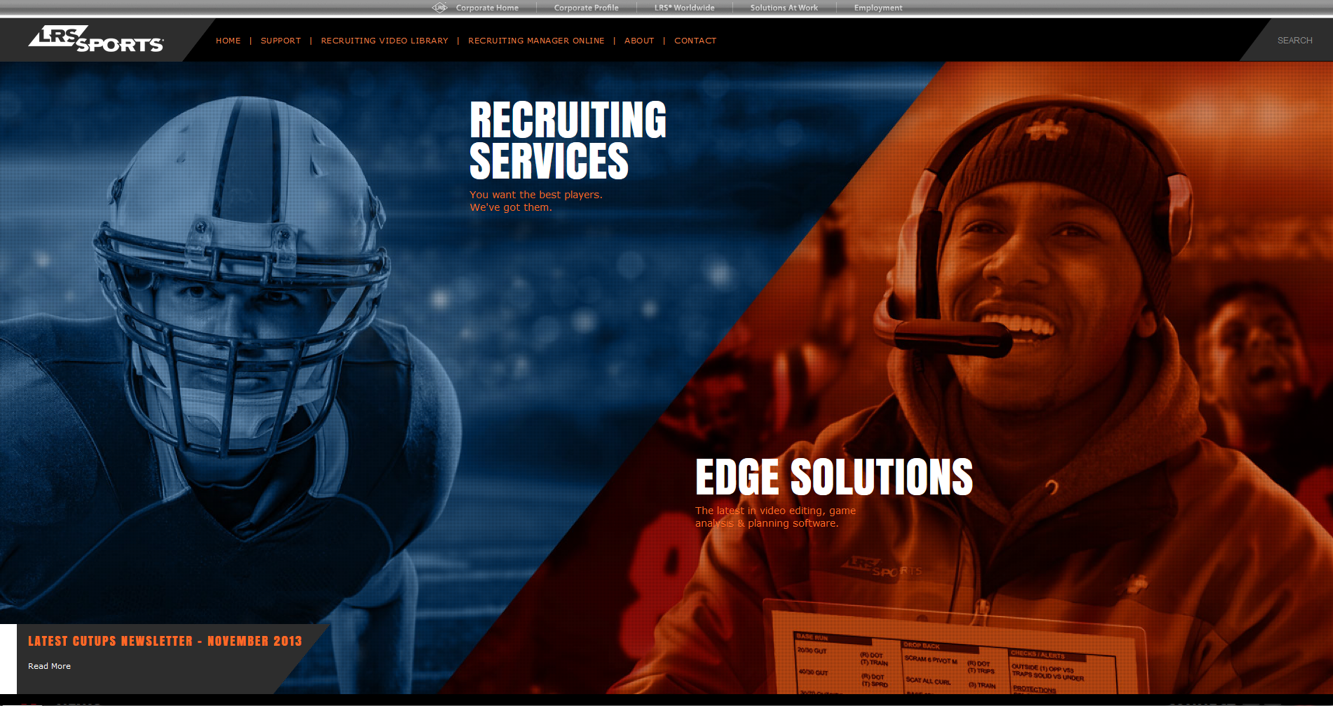
This homepage for LRS Sports was all about visual impact and clarity right out of the gate. I designed it as a split-screen layout, left side for Recruiting Services, right side for Edge Solutions, each with its own bold visual identity and a subtle overlay tint to keep the text readable without losing the energy of the photography.
One of the trickier parts was stacking the text content and overlays above those high-contrast background images. I remember wrestling with z-index in CSS3 to make sure the headings and calls to action didn’t disappear behind anything, especially on responsive breakpoints. It seems small, but that layering tweak was what made everything snap into place visually.
It’s not just eye candy, either. The structure helps guide users based on what they’re here for, player recruitment or video analysis.